
The inside of my app had finally taken shape. As a set of screens, it was done. What the app actually does I am keeping to myself until it is published — that part is a surprise for later.
But then I looked at my phone’s home screen, at all those apps lined up in rows, and something occurred to me. Mine was the only one without a face.
To be precise, it still had the default icon from when I wrapped the app using Capacitor, the tool that turns a web project into a phone app. A flat square with a plain little mark on it. Gmail, Chrome — you know them instantly by their faces. My app did not have one yet.
“Money-grubbing feels wrong to me”
So I brought it to my AI partner Kuro (Claude). The name is mine — I took it from our black cat Jiji, since “kuro” means black in Japanese.
Kuro started by offering me a few directions. A clock combined with a coin. A housework motif with a coin next to it. An abstracted yen mark, the symbol for Japanese currency. All of them were well made. But the moment I saw the coins — the money motif — something snagged.
What I want this app to say is “your time has value.” It is not about pushing people to be greedy about money. If a big money symbol sat right there on the icon, I felt that nuance would get muddy.
So I said it honestly. “Money-grubbing feels wrong to me. Housework and time is enough, isn’t it?”
Kuro changed course without any fuss.
Good instinct. The heart of this app isn’t “making money,” it’s the message “take care of your own time” — so housework plus a clock is gentler and easier to relate to. Let’s go with housework plus clock, based on the same deep green as the app.
That feeling — saying “got it” and switching immediately — is one of the pleasures of building alongside an AI. If I had hired a human designer, I could not have kept saying “actually, drop the money symbol” over and over without feeling awkward. With Kuro I can say what I really think, without holding back.
The broom that turned into a mushroom snack
Once the direction was set, Kuro drew a few versions. A clock and a broom. Deep green background, white clock. It looked good. Housework and time both came across.
Except for one thing I could not stop noticing. The bristles of the broom. They were pulled into a tidy triangle, and no matter how I looked at it, the shape was that of a Japanese chocolate snack shaped like a little mushroom.
“The broom looks like a mushroom-shaped snack. Can you make it more broom-like, and a bit bigger? The angle is good.”
I was laughing as I asked, and Kuro laughed back (probably) and redrew it.
You’re right, the bristles are so triangular right now that it does look like that mushroom snack. I’ll rebuild it so the bristles fan out into a proper tuft. I’ll make it bigger too, and keep the angle exactly as it is — the one you said was good.
This time the tips spread out like a bundle, with thin vertical lines running through them, and it read as a broom. The mushroom snack had safely evolved into a proper broom.
“A little higher.” “A little bigger.”
From there it was one small adjustment after another.
- “Bring the clock to the center, and make it a bit bigger.”
- “Lay the broom over the front.”
- “A little higher.”
Every time I said something in words, Kuro redrew it right away. I could compare several versions on the spot. Even with zero design knowledge, all I had to do was pick — “ah, I like this one better” — and it inched toward the picture in my head.
The interesting part is that I never once touched a pen tool or a layer. I just put the image in my head into words and handed it to Kuro. That was all. It felt like sitting next to a skilled designer and saying out loud, “that bit a little bigger,” “yes, that,” while the drawing finished itself.
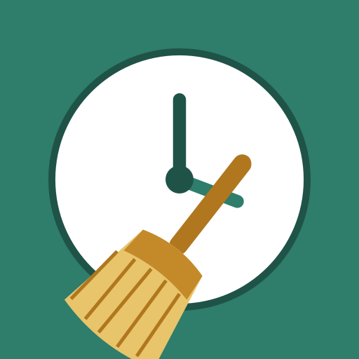
And finally there it was: a deep green background, a large white clock in the middle, a gold broom lying diagonally in front of it. My own icon.
On the home screen, my kid grew up
Kuro also walked me through actually putting the finished icon into the app, one step at a time. Drop the image into a specific folder, type a few commands. All the different icon sizes a phone needs were generated at once. On top of that, the splash screen — the image that flashes for a moment when the app launches — was made in the same green design.
I applied it and opened the home screen of the emulator, the practice phone that runs inside my computer. Gmail, Maps, Chrome lined up in rows — and there, in among them, was the green clock-and-broom icon.
Standing next to Google’s own apps, it did not look out of place at all. The kid that had no face a moment ago was sitting there with a grown-up face on. That moment got to me a little.
From the point of view of what an app does, an icon might be an extra. But whether that small face exists or not is the difference between “something half-built” and “an app.” With a name and a face, my app finally felt ready to go out into the world.
By the way, through all of this icon work, our princess Jiji watched me muttering at my computer with a puzzled look on her face. The very cat my partner’s name came from, keeping an eye on the whole thing.
Next time: the wall
Next I want to write about actually releasing this app — trying to publish it on Google Play, and running into a wall I never saw coming.
If you want the backstory, I wrote earlier about building the prototype in a single day, and the story that follows this one is the four hurdles before publishing on Google Play.